Quantcast
Channel: Fountain Pens & Typewriters
Viewing all 212 articles
Browse latest View live

Computers Vs Typewriters on Cable / Satellite TV


Montana

$
0
0
1950 Montana Luxe


Original Type Bar Rest

Type bars did not align.

Some cork was missing.

The shades were really flattened areas of paint that needed to wrinkle again to match the rest of the housing. This may have been caused by me towel drying some places harder than others or even from holding the housing in that area, or it could have been normal wear that I did not notice before cleaning.

New Type Bar Rest Installed

All the bars nicely aligned

The obvious gap in the rest is now gone.


Another Fountain Pen Friendly Notebook from Books-A-Million

$
0
0
Here is another very affordable notebook I found at our local book store:
The paper in this notebook is a good quality paper and it is not as shiny as the paper in some of the other notebooks that I posted in this blog.  This is an example.  The notebook in the example has a shine to the paper's finish similar to many non-fountain pen friendly paper, but the paper is fine with a fountain pen.  The Piccadilly paper is not shiny.

This Piccadilly notebook is almost twice as expensive, but still half that of a Moleskine.  The notebook example, Moleskine and this Piccadilly all come from China.

The paper in this latest notebook has a nice finish almost like a Moleskine, but not quite as rough.  The inks I tried did not feather nor did they bleed through the page nearly as much as the same inks that I used with my Moleskine notebooks.


It seems the older I get the less I spell correctly.  Here are the pen and ink combinations I used complete with a reference (corrected) to a wrong ink and my mis-spelled words.

All of the pens I used wrote smoothly on this paper.  I did, and do, not like narrow ruled paper for fountain pens.  I usually just write on every other line so I can make my letters at least readable.  When I print I seldom use every other line.

The notebook is a bound notebook of 240 pages.  The band states it is medium ruled, but if laid beside a college ruled notebook the spacing is nearly the same.  The leatherette covering feels much the same as my Moleskine notebooks, and this notebook also has a rear cover pocket for those who like those.  I do find the pockets handy at times, especially when I travel and use a pocket notebook.  The cover pocket makes a nice place to hide money or credit cards since the notebook does not resemble a wallet.


As shown the ink does shadow a bit, but does not bleed through.  I have used other notebooks and papers with pencil and ball point or roller pens that do the same as this example.

The notebook pages are 8.25 inches (210 mm) long and 5 1/8 inches (129 mm) wide.
Fully open the notebook is 10 1/4 inches (260mm) wide.  Closed the notebook is 5/8 inch (16mm) thick.

The notebook has an elastic band closure and a ribbon page marker.

Overall I like this notebook and plan to buy and use more.  Quality-wise this is a much better buy than a Moleskine.  One day I will try a Rhodia.


Skyriter Weekend

$
0
0


The day ended with a Steampunked Skyriter
I sell and give away quite a few transmitter tubes throughout the year to Steampunk people who do everything from use them for decorations, lamps, and night lights.
I generally always have a few pulls and some duds on the workbench so I decided to be silly and rather than only use one small tube I would power a Skyriter by RCA and Sylvania.

The small tube on the left will do 250 watts easily it is a 4CX250B and used in many FM transmitters and many otherapplications.  The big one, a 5762 is nearly obsolete and used in old RCA and Gates AM 1000 watt and 5000 watt transmitters.  2 or 4 tubes are used.  The tube on the right is a 4X500A and will do 500 watts and was pulled from the exciter of an old RCA TV transmitter.  The miniature tube sitting on the heat sink of the big tube is an example of the many tubes used in portable gear used well into the 50s.  Many are still in use although they are obsolete.

Global PC Shipments Plunge!

How Do I Restart a Stalled Blog?

$
0
0


Me operating outside the fire station. 


I have a Baby

$
0
0
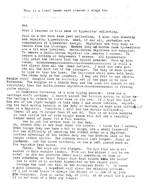
This is what happens when I do a typecast from the work bench


I also repeat myself


I use this on the chrome and other non painted metal and plating


Same as FinishLine, but from Lowe's it is $3.00 to $4.00 cheaper.


Not bad for $5.00, it works too, but smells like rotten tobacco smoke


Can you guess which is the Montana Luxe and which is teh Hermes Baby?


The Luxe, Skyriter, and Baby


Skyriter is a bit larger, taller and heavier than the Baby

A RockMite 40 (Thought notagain might enjoy)
More on the SM4 later.

When an Olympia SM4 Gets Stubborn It Becomes a Parts Machine

$
0
0
Remember my SM4 from my last post?


This is how the space bar will allow the machine to type

From this position to about half way down all carriage functions work fine.

This is the linkage to activate the escapement.  Types fine.

The space bar linkage when properly fitted and the machine will not funcito.

This is what should be normal space bar alignment. The machine will not type.  Even the carriage lock will not align.
I did not put the cover fully on the machine.  I did not find any bent levers or linkages.  I cannot bend the tabs on the front of the case (shown in the above photo) or on the space bar enough to allow the typewriter to work when the cover is on.

Adding good washers exaggerates the situation and really locks the machine.

I cannot find any place that slipped or that can be adjusted.  It does not appear a former owner bent anything.  I have found and magnified many of the photos I found on line that show the bottom workings of the machine. They all look normal to me, but when I make my SM4 normal it will not work

Any suggestions?

I'll move on to the Underwood Universal problems if I ever decide to return to working on it,

Maybe that is why I only paid $5.00!

Sorry for my typos.  From the workbench again.

Sad News

$
0
0
I never knew Mr. Whitlock, but I know there are others in the Typosphere who knew him.  I remember reading about him and he seemed quite a fellow.

At age 96 the oldest living typewriter repairman is no longer with us.

Here is a link to the story:

http://www.nhregister.com/general-news/20130828/new-haven-typewriter-repairman-manson-whitlock-dies-at-96

Here is a link to another story about Mr. Whitlock

 http://www.nhregister.com/opinion/20130829/randall-beach-having-manson-whitlock-as-a-friend-a-delight-to-the-end

He will be sadly missed.

Two Years and Counting

$
0
0

My normally sloppier than this desk.  I really do type with small typewriters alongside the PCs.
Generally it is hard to see the surface of my desk.  I generally have a bit more on it.  Recently I replaced the 24 channel mixer with a smaller 8 channel and put the processors all in a small rack under my radio desk beside my servers and put the CD/DVD duplicators in church.

No new typriters, but a new mascot

$
0
0

Standing guard on the sidewalk.  Non-venomous.

Don't bother me.  I'm watching for bad guys.

Eastern Rat Snake.  Eats lizards, frogs, rats and various small rodents.

Another Fountain Pen Friendly Notebook

$
0
0

$4.99 @ the local Super Target


The original notebooks

Sorry for the sloppy writing.  I've been drinking too much coffee and that makes me shaky.


Available in the USA @ Amazon

Typical of Blogger.  The link was placed under the first section of the typecast.  However Blogger with its usual crap placed in mid-page even though it was correct in the preview.  Rearranging things after a post with Blogger is sucky at best so the link remains out of place. 

Blogger is free and I appreciate that, but it would be nice if it worked.  I have other sites and thought about moving this blog to my radio site.  It takes so long to build a typecast on Blogger that I generally do not want to use even more time to migrate my blog to my radio site.  One day that may happen.  For now the blog will stay on Blogger.

A New Insignia and Garage Typing

$
0
0
I like to keep the shop nice and neat.


This is the coolest Underwood Insignia I have seen.
I noticed on at least one other blog an insignia like or near like this one.  I searched before making my post and did not find it.  There is a similar one on Machines of Loving Grace, but it does not have the Speeds The World's Business encircling the representation of the earth.

I like the action of my Underwoods best of all of my typewriters.  When I first started this blog I only had a Hermes 3000 and a Smith-Corona Classic-12.
Since the Hermes is quite revered in the typosphere I chose to head the blog with Hermes.  After a 2 years of the same I decided it is time for a change, and a much neater logo.  I wonder why Underwood went away from this one.

The Typewriter Behind the Logo

$
0
0

This typewriter was not all that dirty.


The type slugs were really filled with dirt, grime and old ink. The degree symbol must not have been used much as it was not filled with dirt.

pP, q, e, Dd, 9, g, etc. were especially filled.


The small keys on the very left and right of the top row are the TAB Clear and Set.


Margin settings are easily and clearly seen through the slots.  The left is not as visible in the photo as it is red.  I should have fill flashed it.

These are the margin stop setting buttons. They push in and slide.


With a bit more searching on line I found this page on Alan Seaver's Machines of Loving Grace.  It appears the Ace is a rebrand or different name for the same model.  I suspected Universal from looking at other typewriters and from what was on Will Davis's website and Alan's site I found a bit more information.

Scroll about half way down the page in the link to two newer brown and tan Underwood Ace typewriters.

Olympia SM4

$
0
0


This is what the machine looked like when it arrived. It's difficult to see the mildew on the keys from this view.

Mildew covered keys.


After cleaning, not perfect, but not filled with dirt.


This is explained in detail in my August 9, 2013 post


There are several cracks similar to this all over the platen


Olympia's unique method of keeping the key tops parallel to the desk while typing.

Rubber grommets and washer from Ace Hardware


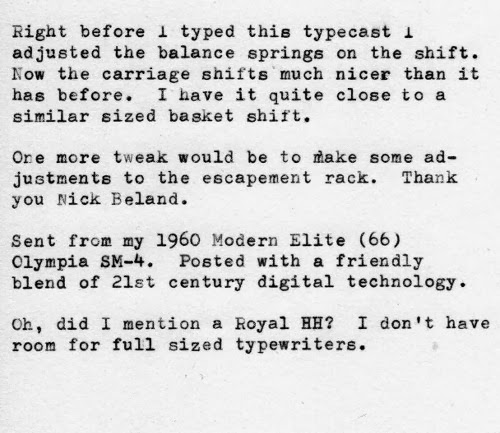
These are the springs that adjust the shift tension.


I have these pulled quite taunt with a bit to spare

I used a dial calipers to set both sides the same.  Counting the exposed threads will work fine too.


The vinyl on the case was in bad shape and peeling.  I removed it and left the wood as it was found. I was going to sand and re-varnish it, but it looks fine as it is shown.
Hint. Look at the end of my workbench -- previous post.


Thanks to Nick Beland for the escapement rail information.
The post on his blog is here.

 I have many more photos taken while this machine was being repaired. I may post all of them directly to the typewriter repair site Nick is building or post them all here in a future post.


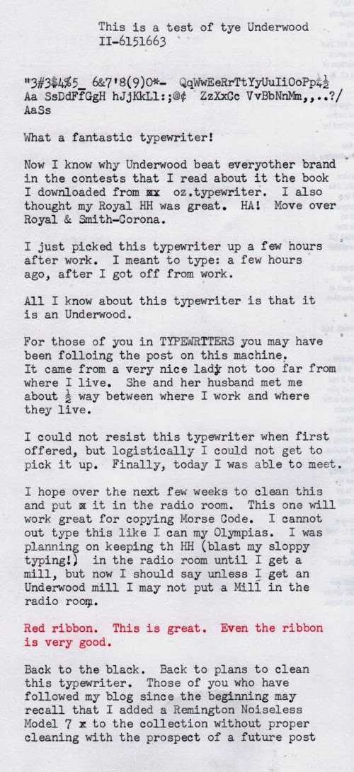
Fantastic Underwood Standard

$
0
0
I could not find the model name for this one.  It looks like several. Closest I can find is the Rhythm Touch.

I guess you can tell I get 2 sections of a typecast from one sheet.

I like the shift lock key on both sides.  The margin set on these is different than the ones on the rear. Left sets the right margin and right sets the left margin.  The setting is made by squeezing the indicator and sliding it into position.

Left Side.  Pressure rollers are still soft.  Platen is hard.  Feeds paper like a champ.  Straight and even from the start all through to the end.

Right Side.

I just noticed I typed one CR on the right and the one on the right.  It should be the one on the left is a carriage return and line feed while the one on the right is just a hook that can move the carriage.

Left end

Right end. Is this a right hand carriage return or is it used in conjunction with the carriage release to guide the carriage to position?  What is the purpose of the chrome piece under it? The tab beside the hook, when pressed, allows the left margin stop to be over-ridden.

The typewriter was quite dusty, but the bottom is near spotless.

Carriage return / line feed

Card guides in position

Card Guides retracted

I thought this was unique.  Nearly hidden is the ribbon guide where the ribbon comes off the spool.  There is a little lever on the spool holder that moves the guide out.  It is spring return. Sorry, I mis-spelled guide.

Halda - Facit,  Underwood had a round smooth easy (easier than my TP-1 actually) to slide carriage rail too.

The only thing on the back (sorry I did not take a photo) is Underwood Standard across the top and in the middle Product of Underwood Corporation.  I've always liked the scale and margin sets right on the front of the carriage.   

The only thing I find referencing 11 is in 1927.  This machine is newer than 1927.  
I believe this is a Rhythm Touch, but I am not sure.  It matches the Underwood Standard from 1947 on Alan Seaver's site.  Mine is not as clean, yet.  The numbers past the 11 (which may indicate the platen or carriage length) put this machine in 1947.

The book I mentioned I found by a link Robert Messenger  posted on his blog, but I could not find it again to link to his post.  The book was written in 1917,
The Evolution of the Typewriter

So far the best 2 typers in my collection are my Underwood Standard Portable 4 Bank and this typewriter.  Nothing is as fast and easy to key as these two.  My Adler J4 comes close, but just does not quite make the fantastic Underwood feel.


Royal HHP a.k.a. the HH

$
0
0


This is my stand-up typing desk.  The HHP sits on top of 2 old speakers at one end of the work bench. This could be captioned A Contrast in Technologies.  The computer is reflecting the ceiling light.

All I did to this one is blow the dust out of it and install a fresh ribbon from Jay Respler.


This is quite like it looked when I received it.


My favorite feature, an easy to read, accurate position indicator.

These are the card guides that flip down by a little lever beside each one.

I ran out of paper.  The last of this section is repeated below.


All the text in the original is clear.  For some reason it blurred.  Blogger is too finicky to remove and try to insert an image.  So please pardon the blurrs.


This little cover flips forward to open allowing removal of the cylinder.


Here it is.  Royal's own name for the ribbon carrier and cylinder.


There are D-shapes in the left end of the platen that fit over the drive pin.

Thought I'd start adding serial number locations.  All I need to do is remember to do it with all typewriters.


I wanted to title this post H-Squared mathematically, but one of the features Blogger lacks is the ability to superscript in the title. I tried coding it and the title does not let me enter html code either.  I thought He2P or H^2P may not be clear to someone not in programming or engineering or math.

A preview of .......?

$
0
0

This has got to be one of my favorite typefaces in the collection.  That said, it takes a lot to beat out Techno.   This new one could very well be the favorite one.

...And The Winner Is...A 1969 Olympia SM9 with #41 Professional Elite Typeface

Live and Direct From....Well, At Least I am in Pennsylvania

$
0
0
This is kind of a hybrid post/typecast.
I'm actually in East Pennsboro Township, but by Google Maps I am in Mechanicsburg (which I know is wrong.  I grew up in the area and Google Maps are wrong 99% of the time.  I would only trust Google maps if I were giving them to an enemy)  Or I am in Enola according to Yahoo! maps which are usually 90% correct.  Now the other map services are about on par with Google.  The address here is probably Enola since I can toss a stone on Wirtzville and Enola is just over the hill.  Earlier in my life this area was farms and East Pennsboro Twp.

So far this typewriter:
Crappy lighting and no tripod.  Sorry for being out of focus.


From the Carina 2.  Needs a bit of aligning.

Surprisingly clean.

Nice typer for a Nakajima.  Quiet, soft platen too.
I did not record and look up the serial number.  Presently the typewriter is back out in the car.

I've not gone typewriter hunting yet today as the snow is now freezing rain. Once it changes back to snow or to rain I may head out again.

I planned on using a Skyriter for my posts, but Mrs. is sleeping and the lobby is quite small and there are a few people out there so I resort to the digital realm.  I like snow and if it were only snow coming down from the clouds I would commandeer one of the tables in the closed pool area and type.

Back to the Carina 2.  I find this a nice typing little typewriter.  It is made by Nakajima from all I can find.  The platen is quite nice as it is soft and quiet. It reminds me of my recently used SM9 or my Skyriters.  The typewriter is fully featured with a tabulator, paper guide, pop-up paper prop, famous Japanese automatic, but I have yet to find anything but uselsess, automatic spacer, 1, 2, or 3 line spacing and variable, a nice touch and nicely built machine for being a later plastic machine. It seems to be more substantial than my Brother.  I will need to compare them when I get home.

This typewriter does not have the cheap tinny sound of the Olympia B12 that I used to have.  The B12 was also a nice typer, but neither the B12 or the Carina 2 come close to the touch or quality of any of the early typewriters in my collection.

Typecast from my Carina 2.  Post from my Dell XPS running elementaryOS
Viewing all 212 articles
Browse latest View live